
Thela
"Created an app for people to find the best street-vendor on the go, who can serve the best fast and healthy foods to workers and travelers who don’t have time to cook food themself."
Smart phone App UX case study
Designed with

Duration
3 Months
My Role
UX Designer/Researcher
Overview
Project
Thela is an app to help people find the best food street-vendor's on the go based on their (user) location, who can serve the best fast and healthy foods to workers and travelers who don’t have time to cook food themself.
Problem
**For the users who love healthy fast food and some mouth watering street-food straight from street vendors beforehand with facilities like booking the table and scheduling parcel.**
Resolution
Thela is created for street vendors who do not have their presence on some "bigger platforms". The app follows a very unique approach to fulfilled it's users: the customers of street food vendors.
They can just book the table sit from home and can enjoy their food on the table of street vendors right when they arrive to the vendor saving their precious time of waiting for their turn to sit on table.
In addition this app can schedule a parcel so is to tell the street vendor "I will be arriving and please get the food ready so I can just pickup and leave".
UX Design Process
Process
I've used User-Centered Design approach, which help me focus on users and their needs. It was an iterative process, which means that I go back to certain phases, again and again, to refine the designs and create the best possible product for their intended users.
Then conducted Primary Research, from direct users were gather to eat street-vendor food, in the form of interviews and surveys. In addition, aimed of Qualitative research questions like “why” or “how did this happen?” and Quantitative Research questions like “how many?” and “how much?”
User Story
Then began creating user stories, based on group of people I interviewed and for the persona’s point of view to inspire and inform design decision.


User Persona
I began conducting user interviews and surveys by asking people open ended questions and allowing them to share more of their experience. This helped me to identify what pain points they shared regarding waiting time at vendors stall which lead to loss of time, also unable to check various menu of the vendors in selected location, these were their frustrations and challenges. However this led me to determine the potential users and finally I created 2 personas whose goals and characteristics represent the needs of a larger group of user.


User Journey
Then with the next step I was able to create User Journey Map which helped me with connecting series of experience a user has as they achieve their specific goal of eating street food.

Problem Statement
For the problem statement, I came up with clear description of the user's needs that should be addressed. This was solely based on Human Centered approach and helped me with broad enough creative freedom to experiment with but narrow enough that can actually be solved by design solution.


Competitive Audit
With competitive audit I came with overview of our competitors strength and weaknesses. Overall it helped me to explore ideas for my designs. Done audit on both direct and indirect competitors.

Link to full competitive audit
Goal Statement
Then I merged the insights from persona, user stories and user journey maps to come up with a focus scope for my designs. Which was in terms of goal statement.
![Goal Statement [My Porfolio]](https://static.wixstatic.com/media/51da4c_ddf0ed19cfa14e96911197a10d88a644~mv2.jpg/v1/fill/w_596,h_333,al_c,q_80,usm_0.66_1.00_0.01,enc_avif,quality_auto/Goal%20Statement%20%5BMy%20Porfolio%5D.jpg)
User Flow
Overall from all the insights, I understood clearly who our users are and how they behave. This helped with the path of creating a user flow which was the path taken by typical user on the app, so they can complete a task from start to finish.

Wireframes and Lo-Fi prototype
After sketching Lo-Fi wireframes on paper, I turned it to digital wireframe in order to give mainly attention on the functionality and organized contents on each screen to provide users a pat to move through the system easily.
The goal was to prioritize content for each screen and outline clear pats for the users.

Usability study
Findings
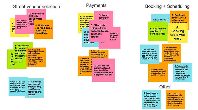
After creating low fidelity wireframes, conducted a usability study, had 5 real feedback from participants. In this stage, I analyzed and synthesized all of the feedback from my research to gather insights and identity themes and patterns in one place.
Organizing this data by using an affinity diagram helped me identify these themes and patterns, and come up with actionable insights.

Updated Designs
Design 1
Most participants were not able to see payment option clearly
-
4 out of 5 participants had trouble finding payment option.
-
Users need a new payment page with more payment methods in it and then finally confirmation of order is booked or scheduled.
"I think the payment should go with the flow like once order is selected and schedule time is selected then payment should be the last option on the app then and then only order needs to be placed"
Design 2
Most participants were not able to get idea about what a schedule button means
-
4 out of 5 participants were confused by the button called Schedule.
-
Users want it to be renamed and cues about how scheduling works.
"If I will get a schedule time then I will just pay for my purchase"
Design 3
Participants had trouble Adding items to the cart button
-
3 out of 5 participants had trouble finding an Add to cart button.
-
Users want the button to be renamed and need a more intuitive way to access the add to cart feature or can add the items from the vendor menu page itself.
"Amm I think I need to click on confirm button which has a plus sign"
Design 4
Participants need estimated or standard time from vendors about their order to get ready
-
2 out of 5 participants had trouble getting the idea of picking time from their end
-
Users were not able to get the idea about why they can give time to street vendors on the app from their end.
"I think the app should give in app payment feature as well a message that says order is ready for pickup or in-process with estimated time on it"
Design 5
Participant would like to have a message or in app code which can be confirmed at street vendor while taking the order.
-
1 out of 5 participants want the order needs to be verified/authorized at vendors location either by scheduling or booking table.
-
A proper authorization code or text message needs to be sent to user to authorize the order on first hand at vendors location then only user can pick up the order or by booking table can eat at the vendors location
Design 6
Participants had trouble getting add ons to their ordered food.
-
2 out of 5 participants had trouble getting add ons to their ordered food.
-
Users were confused about why I am not able to add or customize my order.
"I see the app is easy to use but options like Add cooking instructions or Add on's should be provided while the customer is on checkout".
Before
After

Before

Before

Before


Before
Before


After

After

After


After
After

Refined Mockups

Design System
Till now I explored the importance of visual design elements and principles and how to lay out a page. Then I came with a new design system from scratch which was a series of reusable elements and guideline that allowed me to design and develop the "Thela" application, following predetermined standards.
It also helped me to combine all of these different guidelines in one place, including important information like typography, components, color palettes, and more.

Thank you for Scrolling
Prototype in Figma
Accessibility Considerations


Takeaways
Impact:
The app makes user feel like a real app with all the functionalities and meet their needs in more engaging and fun-to-use way.
One quote from participant feedback:
“The app made it so easy and fun to book table or pickup the order with parcel option! I would definitely use this app on the go next time when I want to eat at any street vendor food stall.”
What I learned:
While designing the street vendors app, I learned that, first ideas for the app are only the beginning of the process. Usability studies and peer feedback influenced each iteration of the app’s designs.